Innerstrength Health is a forward-thinking FitTech company dedicated to empowering health professionals to prescribe, deliver, and monitor personalized education and exercise programs for patients. Their mission was clear—but the app's user experience was holding them back.
The Innerstrength team needed to solve critical engagement and usability issues that were limiting both user retention and overall effectiveness of their platform. They asked me to:
Improve the overall user experience
Boost user engagement and retention
Refresh the brand’s visual identity across the app ecosystem
Through direct user feedback, we identified specific friction points:
Complex setup: Creating routines was time-consuming and unintuitive.
Lack of feedback loops: Users didn’t receive recognition or feedback after submitting progress or exercises.
Low engagement: The app struggled to keep users returning consistently.
Data transparency gaps: Users weren’t sure when their app last synced with wearable devices.
Uninspiring design: Users found the UI outdated compared to modern fitness apps.
These issues not only impacted user satisfaction but also risked long-term adoption—key concerns for stakeholders.

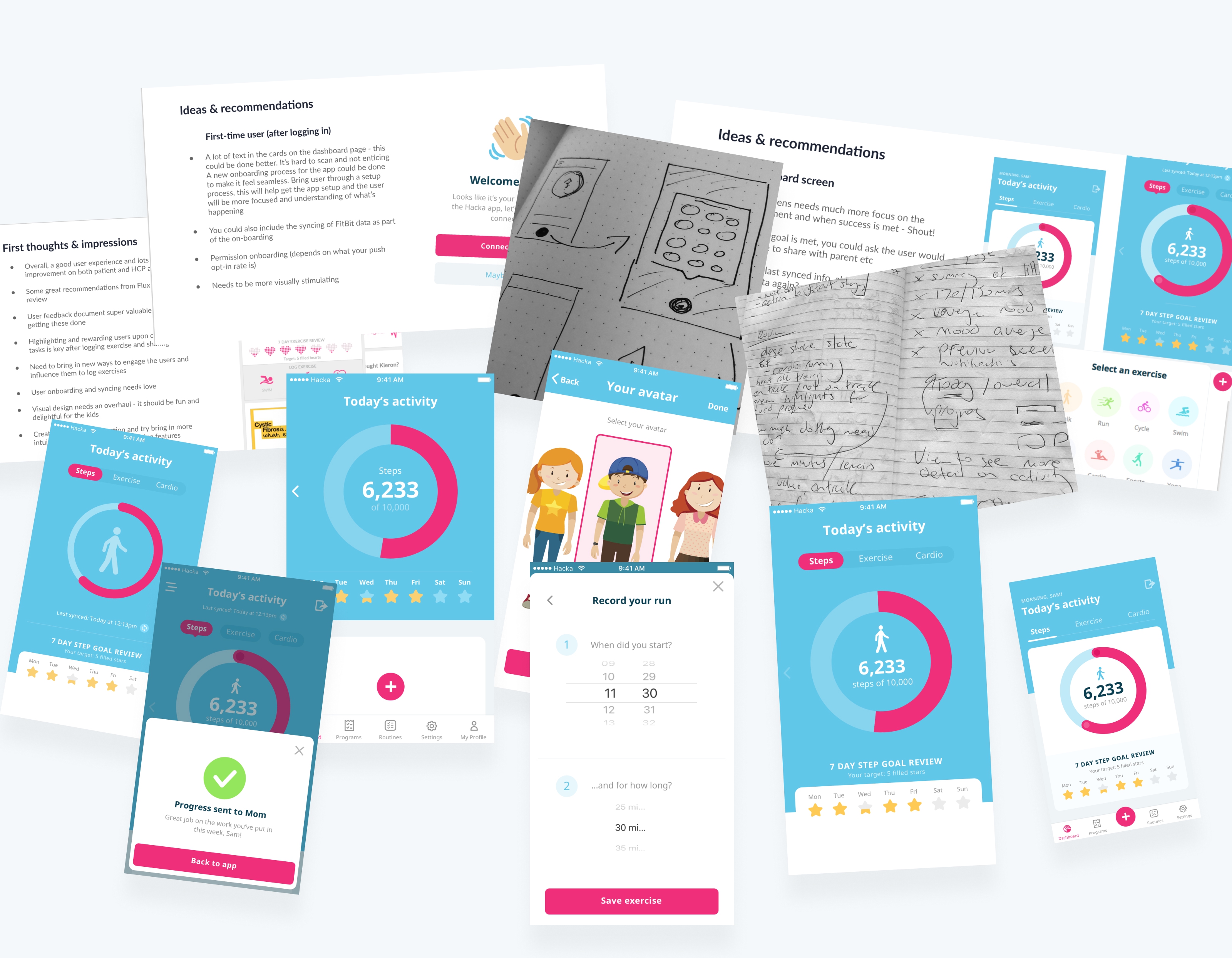
🔍 Discovery & Audit:
I led a full UX audit, mapping user flows, identifying bottlenecks, and benchmarking against competing fitness apps. The goal was to reduce friction points and identify opportunities for deeper engagement.
💡 Ideation & UX Overhaul:
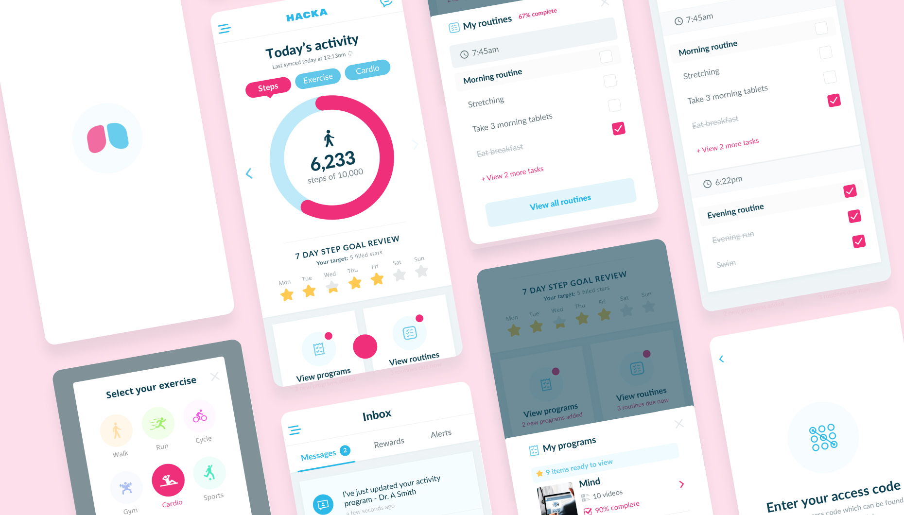
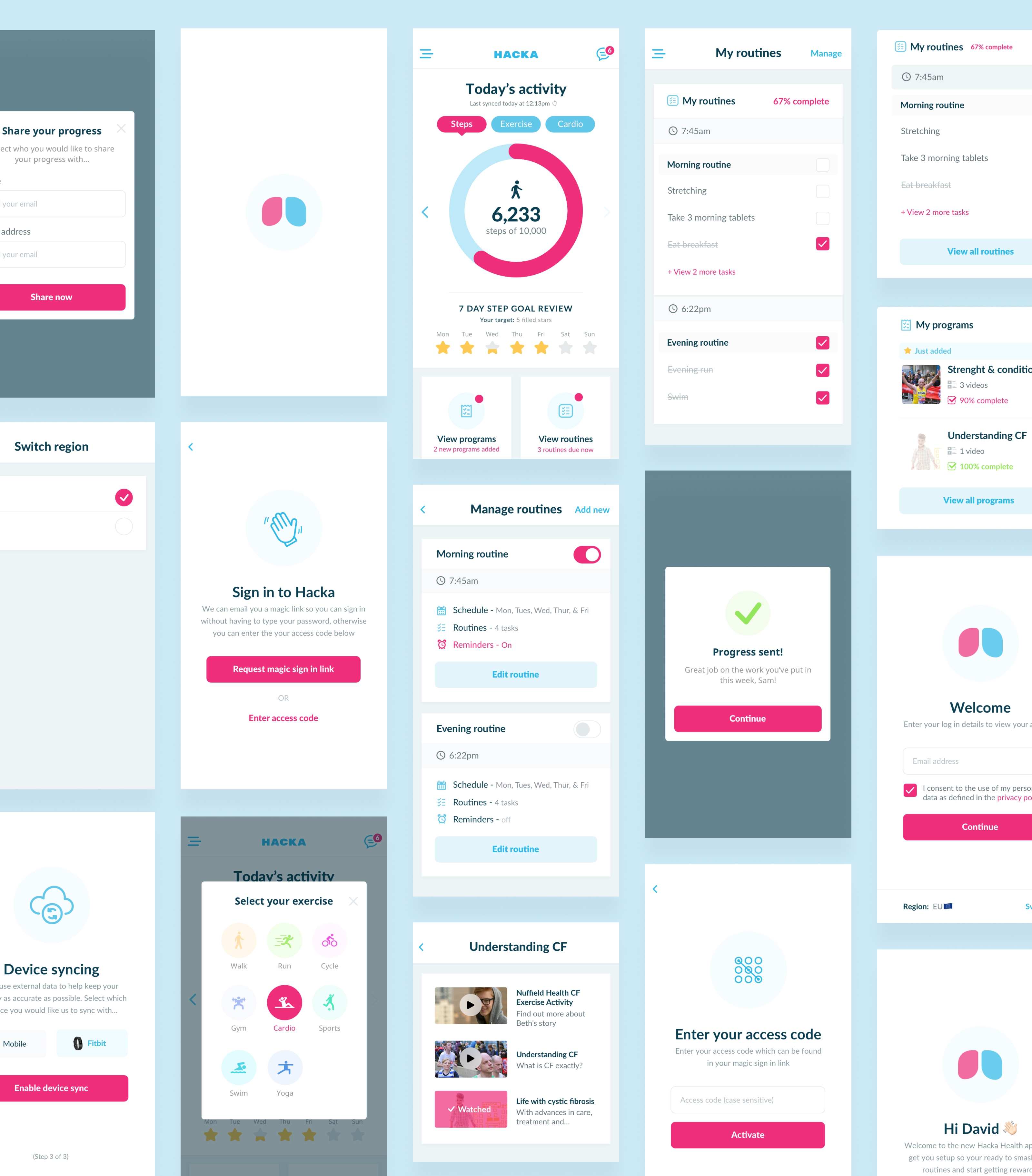
Streamlined Routine Creation: Simplified steps to minimize user effort and time.
Introduced Gamification: Designed a points-based rewards system with avatars, badges, and streak tracking to increase motivation and retention.
Enhanced Feedback Loops: Users now receive instant recognition upon completing tasks, boosting a sense of accomplishment.
Data Transparency: Incorporated clear sync indicators, so users always know when their data was last updated.
Visual Refresh: Shifted the design language to a more vibrant, modern aesthetic that aligns with user expectations from popular fitness apps.
✅ Quick Wins & Long-Term Impact:
Alongside major changes, I identified simple yet effective tweaks—like improving micro-interactions and button placements—that improved usability without heavy development lift.
The Outcome
🚀 A Complete App Overhaul:
Simplified onboarding & routine creation — reducing setup time by 40%.
New “Inbox” feature enabling direct 1:1 communication between parents and physicians.
Gamified engagement loops leading to higher user retention.
A fresh, dynamic visual identity that resonates with both patients and professionals.
The redesigned app was launched in October 2018 and is now in trial with clinics across the US. Early feedback highlights improvements in both user satisfaction and app engagement.
I'm always looking to chat to passionate people who are looking make their product. Feel free to get in touch!
Let's chat!